Alongside logo and colour, typography is an important visual tool for conveying meaning and character within a brand identity.
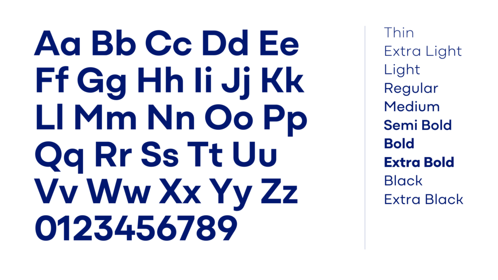
Primary Font – Mozaic GEO
The Primary typeface, Mozaic GEO, is to be used for all communication where custom typography is available.
Chosen for its clean, modern design and easy readability, it is perfect for headlines and body copy. Its geometric structure conveys a sense of trustworthiness and professionalism, perfectly aligning with our brand’s commitment to clarity and care.
This versatile typeface ensures our messaging is approachable and accessible across all mediums.
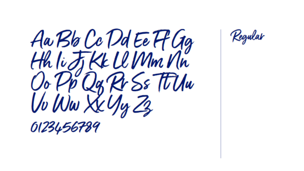
Secondary Font – Gotcha Standup
Gotcha Standup is our secondary typeface for sub-headings and callouts. Our callout font is designed to bring warmth and personality to our subheadings and key messages.
It should be used sparingly to highlight important information or to create visual emphasis. Ensure it is always legible, using it in larger sizes and appropriate colour contrasts for clear communication.
This font is not intended for body text or extensive reading material.
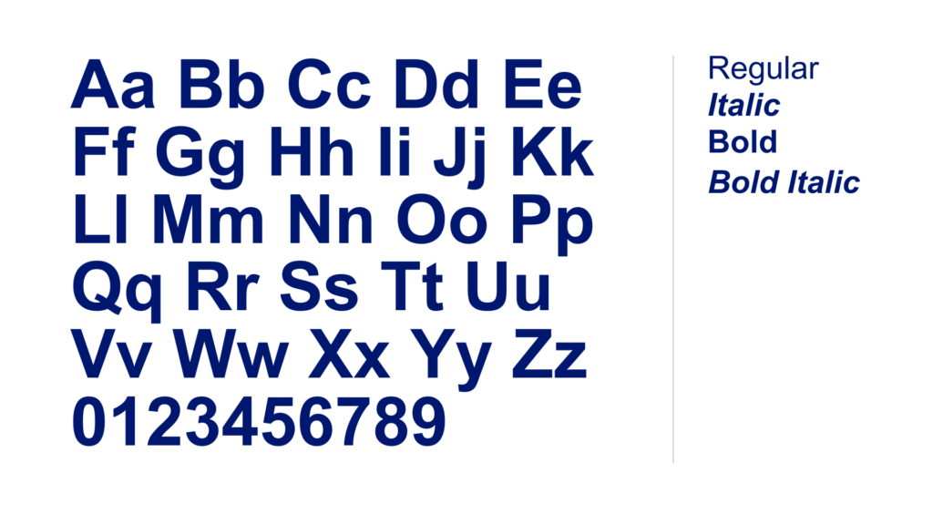
Replacement Font – Arial
For instances where Mozaic Geo is unavailable, Arial serves as the brand’s substitution font. This includes Microsoft Office® applications and electronic mail platforms.
Arial is a widely available, clean, and highly legible typeface that ensures consistency and accessibility across all communications.