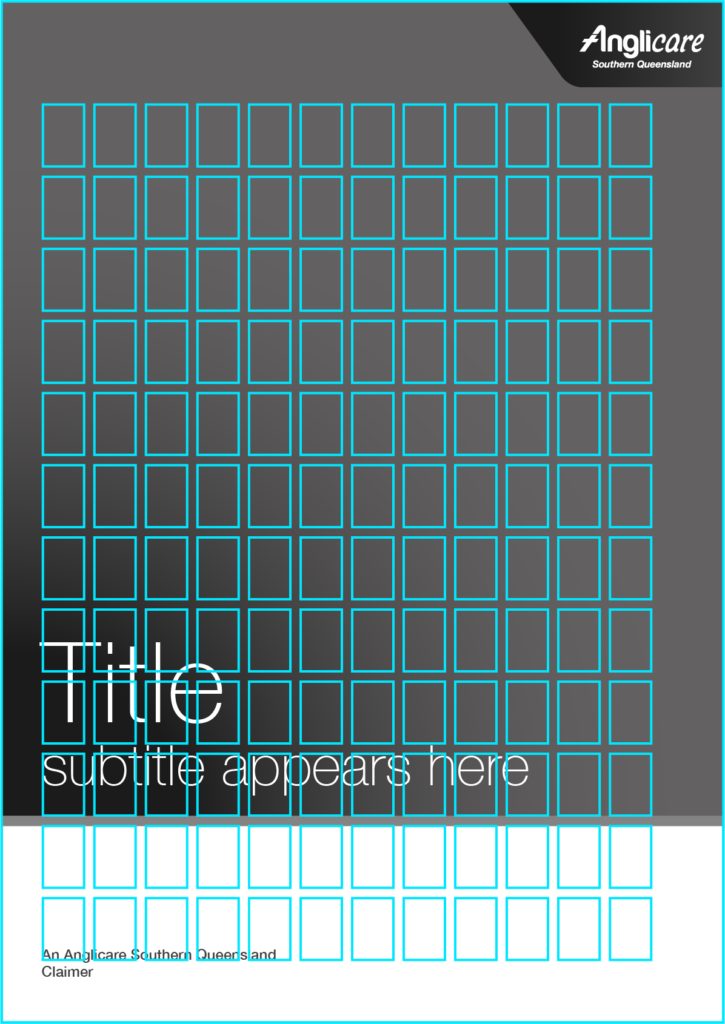
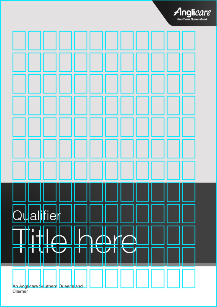
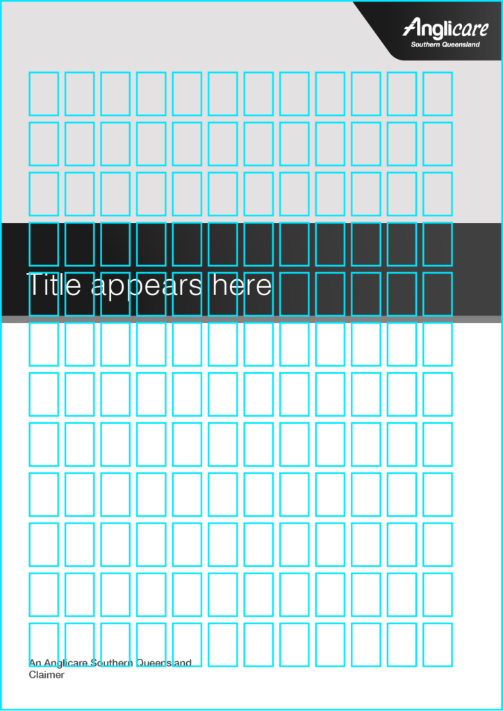
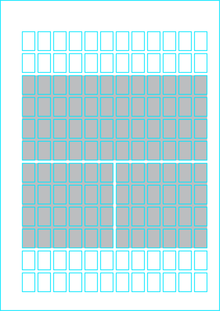
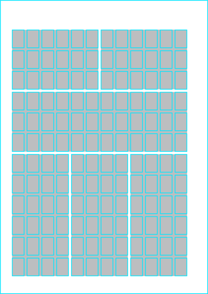
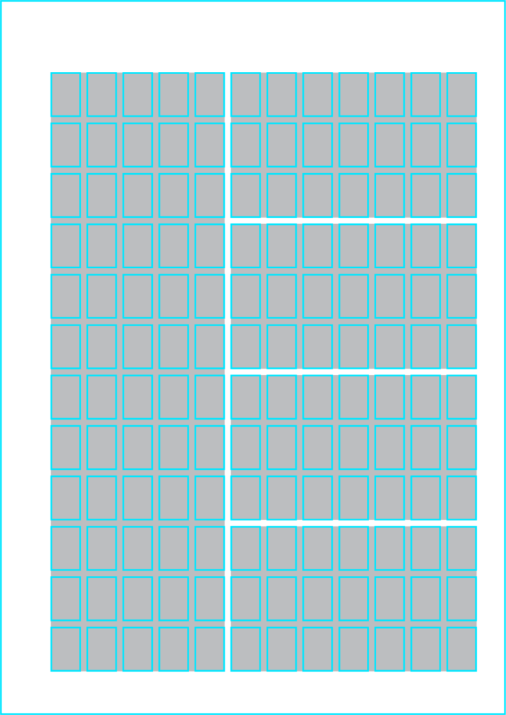
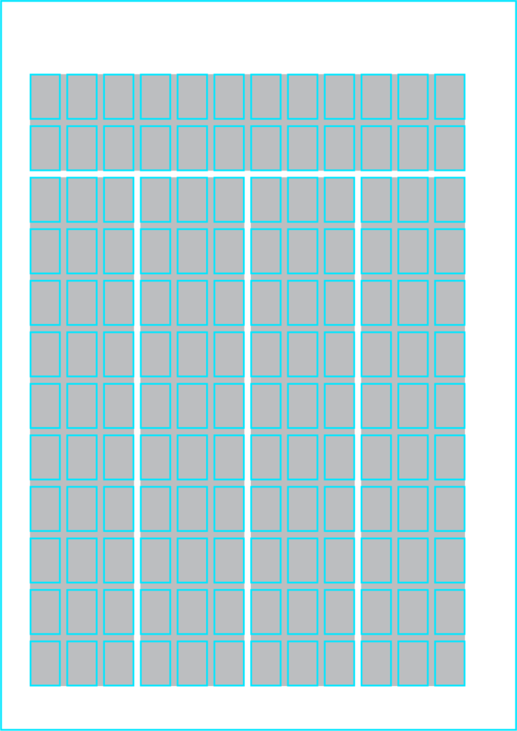
Colour is an important part of our brand identity. It’s a tool we use to promote brand recognition at a glance. Colour is also be used to project emotion and instil our brand values, visually.
The Anglicare Southern Queensland Brand Identity features a suite of colour palettes, and accompanying shape devices, providing a platform for consistent, yet versatile visual representation that effectively highlights our service categories.
Secondary palettes have been developed for use in service-specific materials, providing energy and divisional differentiation in customer facing touch points.
The secondary palette is restricted to seasonal and occasional use, and should not be used for standard communications, or without the approval of the Marketing Department.
When using the colour palettes consider:
- the audience
- appropriate contrast for legibility and accessibility
- the restrictions of the final medium
Our aim is to establish a visual identity that forges a distinct, contemporary, and meaningful primary colour palette that represents the unique relationship between Anglicare, and its diverse clients and services.
The corporate colour palette is Anglicare Southern Queensland’s primary colour palette and is used across all branded corporate materials, or when representing the entire brand.
- Cobalt represents heritage, stability, trust and healing.
- Solace represents warmth, care, belonging and honours our history.
- Iris represents inclusivity, knowledge, possibility and strength.
To further support the brand’s colour palette, shape devices have been developed for use across branded materials. These graphic devices serve as a versatile tool for storytelling, whether through imagery, colour highlights, or other design features. The negative space as panels or sectionals. Shapes that have been developed for use across all branded materials include:
- ‘A’: Derived from the top section of the ‘A’ in our Anglicare logo, this shape is subtle, versatile and uniquely Anglicare.
- Foundation: The rounded-rectangle represents our strong foundation and steadfast commitment to our community. It can be used across all sub-brands and is perfect for housing imagery.
Primary palette
Cobalt
C100 M96 Y23 K21
R0 G23 B112
#001770
PMS 2748C
Solace
C0 M86 Y100 K0
R254 G72 B25
#FE4819
PMS 172C
Iris
C67 M83 Y0 K0
R117 G59 B189
#753BBD
PMS 266C
Supporting palette
Our supporting colour palette has been designed to support the primary palettes of each Anglicare brand (Corporate, Aged Care, and Children, Youth & Families). They complement the primary tones, enhancing flexibility while maintaining accessibility. These colours—ranging from soft neutrals to bold, contrasting hues—work harmoniously to create balance and ensure legibility across all mediums.
When used together with the primary palette, they reinforce the brand’s welcoming, inclusive and professional tone, ensuring clear communication while providing a versatile visual system that adapts to the needs of our diverse audience.
Carbon
C50 M19 Y0 K96
R8 G20 B31
#08141f
PMS Black 6C
Midnight
C100 M99 Y25 K42
R6 G0 B84
#060054
PMS 2768C
Sun
C0 M41 Y90 K0
R255 G166 B48
#ffa630
PMS 1375C
Sand
C0 M5 Y26 K0
R255 G238 B195
#ffeec3
PMS 7401C
Quartz
C1 M3 Y6 K0
R250 G243 B236
#faf3ec
PMS 719C @ 20%
Services Palette
Aged Care Services
To support our primary colour palette, we have introduced three secondary colours for Aged Care, which blend seamlessly with our primary and supporting colours.
The soft neutrals and earthy accents foster a welcoming and calming environment, reinforcing the compassionate and caring nature of our aged care brand, while ensuring clarity and cohesion across all communications.
Supporting and strengthening the colour palette, our Aged Care Services are further represented by the circle shape. The circle represents partnership, holistic care and a full life. The circle can be used as solid background panels, illustrative compositions, image containers, or outlined paths.
See this colour palette and shapes in action in our brand application examples.
Cobalt
C100 M96 Y23 K21
R0 G23 B112
#001770
PMS 2748C
Solace
C0 M86 Y100 K0
R254 G72 B25
#FE4819
PMS 172C
Sandstone
C7 M24 Y45 K0
R235 G195 B147
#EBC393
PMS 719C
Rose
C0 M59 Y42 K0
R255 G135 B125
#FF877D
PMS 170C
Sage
C87 M34 Y57 K14
R9 G119 B112
#097770
PMS 7717C
Children, Youth & Family Services
Three secondary colours for Children, Youth & Families have been introduced to complement our primary and tertiary colours, adding a bright and welcoming energy.
These playful, yet harmonious tones inspire a sense of optimism and inclusivity that reflects our Children, Youth & Family services. Together, they balance professionalism with an inspiring and empowering feel.
To support the colour palette, our Children, Youth & Families Services are further represented by the doorway shape. The doorway represents opportunity, safety and a sense of belonging. The doorway can be used as solid background panels, illustrative compositions, image containers, or outlined paths.
See this colour palette and shapes in action in our brand application examples.
Cobalt
C100 M96 Y23 K21
R0 G23 B112
#001770
PMS 2748C
Iris
C67 M83 Y0 K0
R117 G59 B189
#753BBD
PMS 266C
Lavender
C24 M37 Y0 K0
R194 G163 B233
#C2A3E9
PMS 264C
Berry
C26 M91 Y1 K0
R188 G59 B148
#BC3B94
PMS 240C
Apple
C49 M0 Y66 K0
R132 G210 B130
#84D282
PMS 359C
Gradient Elements
Gradients are an important element of the Anglicare Southern Queensland brand identity.
They provide subtle energy, depth and interest to the basic brand elements without overpowering them.
The gradients used in the brand identity are carefully measured and controlled.
To avoid brand dilution care should be taken not to deviate from these formulas, especially as they relate to key brand assets and identifiers.
When using gradients:
- consider the emotional message and impact of the communication
- use gradients to highlight key messages, but don’t over use them
- ensure appropriate contrast for legibility and accessibility
- the reproduction restrictions of the final medium
- never reposition the transition points of the gradients
Gradient sets
The energy gradient is an offset blend between ASQ Energy and ASQ Energy Soft. It is used to identify children and family programs and initiatives.
The corporate gradient is an offset blend between ASQ Heritage and ASQ Depth. It is the only gradient that uses a darker shade versus a tint. It is used across all communications to identify and connect to the Anglicare Southern Queensland brand.
The celebration gradient is restricted to seasonal and occasional use, and should not be used for standard communications, or without the approval of the Marketing Department. It is designed to simulate a golden sheen, and adds depth as well as a sense of prestige and celebration.
The Modular Grid
Not only does an effective grid provide the rhythm for a design, it is an important part of making content accessible, and helping the viewer to understand where to find the next piece of information in the layout.
Grids exist primarily to help determine the position and balance for a layout.
This can be used to help ensure that content is presented in an easy-to-understand order, but conversely by providing a firm foundation a grid can also be used to highlight specific areas of content simply by breaking elements outside the grid. The viewer will naturally identify these break-outs and be drawn towards them, giving the designer the opportunity to adjust the hierarchy of a layout and tweak the semantic meaning of a piece of work.
When using gradients:
- consider the emotional message and impact of the communication
- use gradients to highlight key messages, but don’t over use them
- ensure appropriate contrast for legibility and accessibility
- the reproduction restrictions of the final medium
- never reposition the transition points of the gradients
The ASQ Grid
Top margin: 30mm
Inside Margin: 12mm
Bottom margin: 18mm
Outside Margin: 21mm
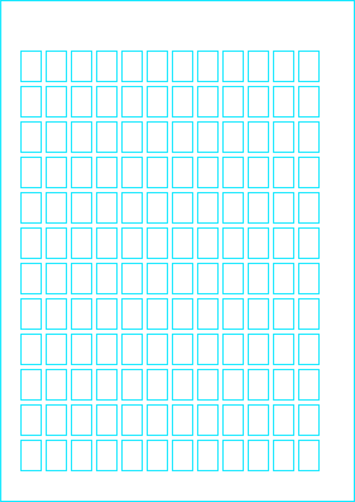
Modules: 12 x 18mm
Gutters and Flows are 3mm each
Designed for A series proportions, the principles in the grid can be adapted for a variety of platforms such as emails and banners.
At A4 size, the grid works on a 3mm unit. Modules are 12mm x 18mm (4 x 6 units), with 3mm (1 unit) gutters and flows. The grid consists of 12 columns and 12 rows, allowing for flexibility and variation in its format.
The modular grid can be used to create a variety of different layouts.
The grid has been designed for facing page layouts, with a smaller inner margin. It can also be adapted for single page spreads by adjusting the inner and outer margins to be equal (for an A4 page this would be 16.5mm).
The modular grid can be adapted to different formats.
The grid has been designed for facing page layouts, with a smaller inner margin. It can also be adapted for single page spreads by adjusting the inner and outer margins to be equal (for an A4 page this would be 16.5mm).
Framing Devices
Outside of fixed elements like the trade mark, other elements are a flexible frame work that provides consistency through repetition.
The use of a framing devices also helps avoid issues of image suitablilty, legibility, and accessibility.
The framing devices are intended to be flexible, while maintaining consistency.
The trade mark housing always appears in the top right in fixed position.
Service identifier: takes on the colour of the service being represented.
Message block: Houses key messaging in variable formats
The service statement always appears in the bottom left in a fixed position, noting the division responsible for the initiative or service.
Image block: Used to house photography or illustration
Certain elements are designed to be positioned in a fixed manner (as shown above and below), while others are flexible in sizing and postioning.
Using framing devices with the grid
While the framing devices are intended to be flexible, their vertical positions should align to the grid as shown in the examples above.
Elements contained by the framing devices need not conform to the grid, but care and consideration should be given to understand and align to the overall tone, intent and clarity of each communication.