A trademark (logo) is a critical tool for brand identification and recall.
The logo is our brand’s most important visual asset and as such all reproductions must use original artwork. Please do not redraw, alter, photocopy or recreate it.
In the interest of protecting the integrity of the Anglicare Southern Queensland brand, we have created basic logo guidelines to assist you when using the logo.
Please treat the Anglicare Southern Queensland logo and all variations of it with respect. It is the primary representation of our brand and its presentation should always be consistent.
Our trademark tells our story
Our logo is an important communication tool. It is a visual identifier for the brand and portrays our mission and values. It reflects our roots in the church while telling a story of who we are.
Our brand is built on Care, Trust, Leading, and Possibility, beliefs that guide everything we do.
In Aged Care Services, we emphasise Trust and Care, ensuring clients feel supported and confident they can turn to us during life’s vulnerable moments. This is represented by the use of burnt orange (Solace), providing warmth, compassion and a sense of belonging.
For Children, Youth, and Families, we focus on Possibility and Leading, inspiring change and empowering young people and families to achieve their full potential. Purple (Iris) represents these services, portraying strength, opportunity and inclusiveness.
Navy (Cobalt) is used to complement and link both sides of the organisation, representing trust, dependability and our heritage.
Our logo represents our organisation and what we provide our clients. One united brand, with two distinct voices to effectively connect and engage our diverse client groups.
A variety of file formats have been supplied within this manual to ensure the best possible result for each application.
The following points provide a brief guide to help you select the most appropriate file.
Selecting file formats
CMYK variations are the preferred setup for print; while RGB is designed for digital applications.
eps (vector) files are the default files and should be used where possible. They are resolution independent, meaning they can be scaled to any size.
jpg and png files are fixed resolution, meaning they cannot, and should not be enlarged.
Generally speaking:
• eps files should be used where possible
• jpg and png should only be used when eps is not possible

Southern Queensland is our Primary logo and should be used when communicating on behalf of the entire brand, or for any use outside of Southern Queensland.
The primary logo is a 3-colour version on a solid light-coloured background.
All elements must remain at their fixed proportions and should not be scaled, re-positioned, re-coloured or altered in any way.
The trademark should always be created from original, digital artwork and must not be recreated or redrawn. It must not be reproduced at a size smaller than the specified minimum size, and the specified clear space must be maintained.
See the section on File Selection if you are unsure of the most appropriate format.
Usage Guide
Trademark Clear Space
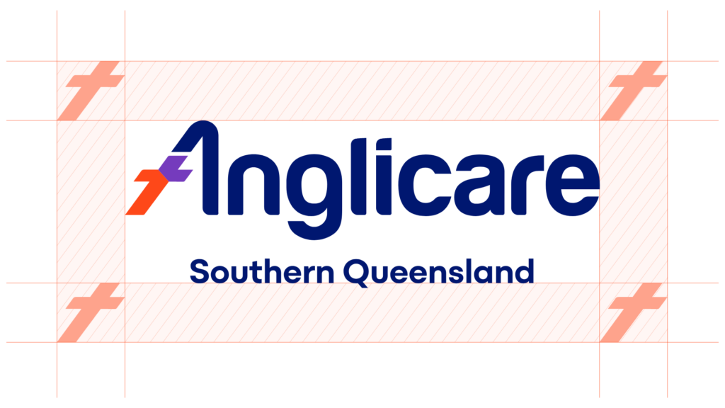
The clear space is an area around the trade mark which must not be broken by any other graphic element, logo, text, image, or page edge.
It increases the visual impact of the logo and ensures there is no conflict with other elements. The most common exception to this rule is when the logo is superimposed directly on top of an image such as a photograph (in which case the logo should be placed in a neutral area and away from the main focus of the picture).
The clear space for the trademark, as set out above, should at all times be observed and maintained. The clear space is measured using the dimensions of the ‘Anglicare cross’ and surrounds the logo as illustrated above.
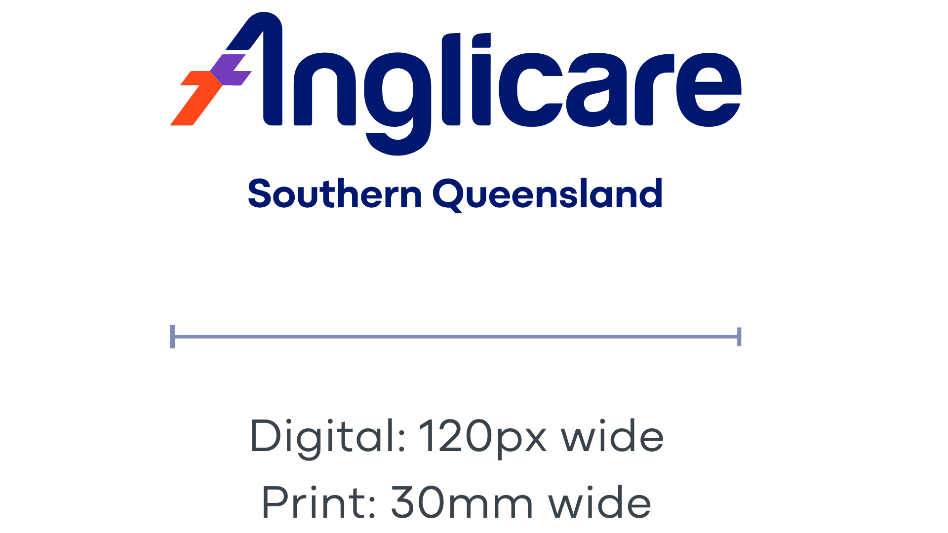
To ensure legibility, clarity, and brand consistency, the main logo should
never be reduced to less than 30mm wide (print), 120px wide (digital).
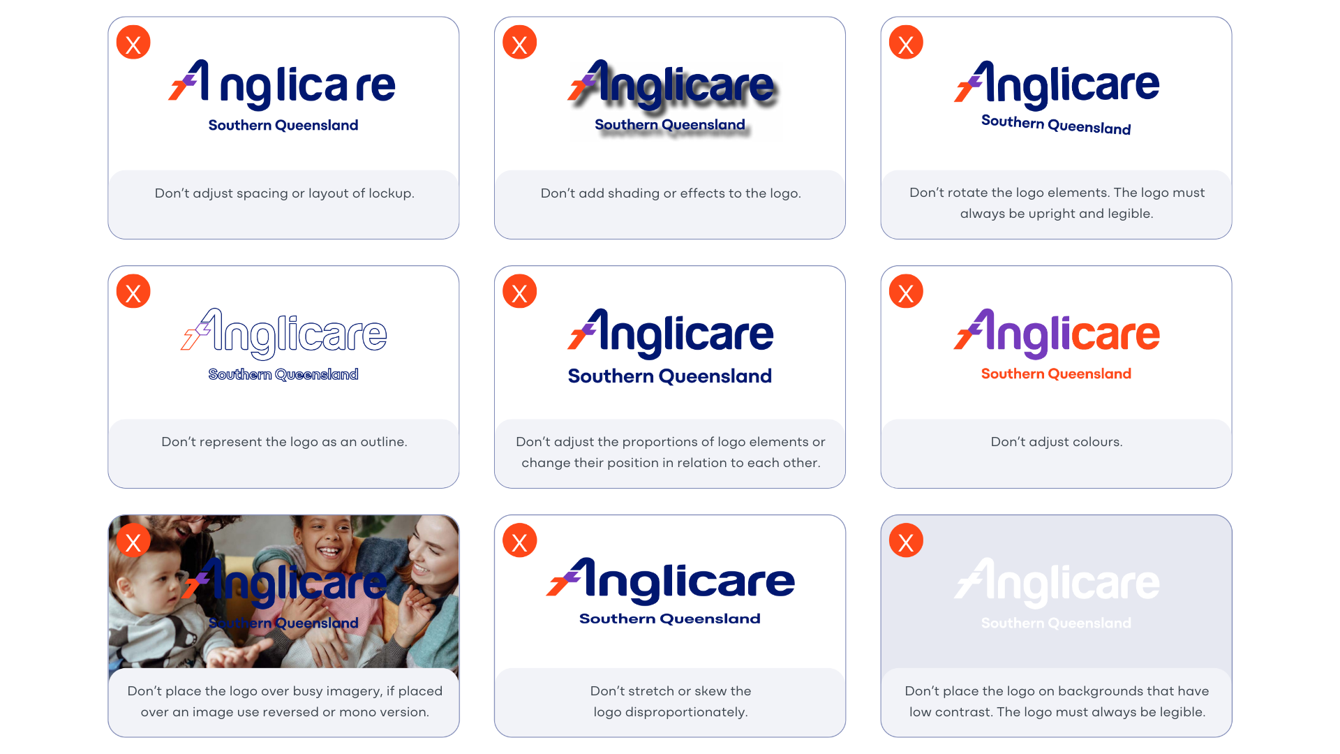
Misuse of the logo
In order to maintain a strong, consistent, and successful brand, our logo must be kept in the original state in which it was designed. Please do not add to or change anything about the trademark.
These usage guidelines apply to all versions of the logo.
Old versions of the logo have been retired, and therefore should no longer be used in any application.
Reverse Trademark
The reverse trademark should be used in circumstances where the primary trademark would not be legible, for example when placing the logo on a coloured background or image.
Whenever the trademark is reversed, care should be taken to ensure legibility and accessibility for all users, especially at smaller sizes.
All elements must remain at their fixed proportions and should not be scaled, re-positioned, or altered in any way.
The trademark should always be created from original, digital artwork and must not be recreated or redrawn. It must not be reproduced at a size smaller than the specified minimum size, and the specified clear space must be maintained.
See the section on File Selection if you are unsure of the most appropriate format.
Monotone Trademark
The monotone trademark variant should be used when full colour reproduction is not available.
It should be used in applications where printing in a single colour.
All elements must remain at their fixed proportions and should not be scaled, re-positioned, or altered in any way.
The trademark should always be created from original, digital artwork and must not be recreated or redrawn. It must not be reproduced at a size smaller than the specified minimum size, and the specified clear space must be maintained.
See the section on File Selection if you are unsure of the most appropriate format.
Alternate Lockups
Alternate logo lockups are available for use at the discretion of the Marketing Team.
These lockups represent the approved versions of the logo, and are available in full-colour, 1-colour, monochrome, and simplified options, designed for use across various backgrounds and formats.
These variants ensure the logo remains versatile and recognisable in diverse applications while maintaining brand consistency
These logo variations require approval from the Marketing Team and can be requested by emailing: [email protected]
